What’s the “react” way to trigger a modal when a button is clicked?
If you come from Angular, jQuery, or even just vanilla JS, your thought process for opening a modal dialog probably goes something like this:
- I need to open a modal.
- I’ll just call the
modalfunction, which opens it up. - Then the modal will wait for its “Close” button to be clicked.
- When “Close” is clicked I’ll call another function to close it.
But with React it’s like:
- I need to open a modal.
- What? How do I even
The root of the problem is this: How do you make something appear onscreen, in response to an event, in this new world where all you have is props and state? How can you make something happen?
A Modal
Let’s get right to it. I’ll just straight up give you a Modal component, and then we’ll walk through it:
import React from 'react';
import PropTypes from 'prop-types';
class Modal extends React.Component {
render() {
// Render nothing if the "show" prop is false
if(!this.props.show) {
return null;
}
// The gray background
const backdropStyle = {
position: 'fixed',
top: 0,
bottom: 0,
left: 0,
right: 0,
backgroundColor: 'rgba(0,0,0,0.3)',
padding: 50
};
// The modal "window"
const modalStyle = {
backgroundColor: '#fff',
borderRadius: 5,
maxWidth: 500,
minHeight: 300,
margin: '0 auto',
padding: 30
};
return (
<div className="backdrop" style={{backdropStyle}}>
<div className="modal" style={{modalStyle}}>
{this.props.children}
<div className="footer">
<button onClick={this.props.onClose}>
Close
</button>
</div>
</div>
</div>
);
}
}
Modal.propTypes = {
onClose: PropTypes.func.isRequired,
show: PropTypes.bool,
children: PropTypes.node
};
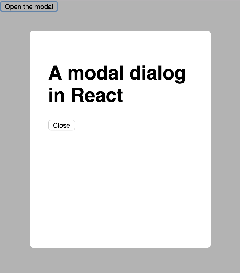
export default Modal;This component is at least 50% inline styles by volume. I almost left them out, but I decided not to because having them really gives it the desired effect – the modal sits on top of a gray background that obscures everything behind it, and all you can do is click that Close button. If you try out this code you’ll see what I mean.
How It Works
The most important parts here are the first few lines, and the onClick handler.
This bit here is responsible for “showing” or “hiding” the modal:
if(!this.props.show) {
  return null;
}
Rather, it is either rendering the modal (when show is true) or nothing (when show is false).
Contrast this to jQuery where you might show and hide an element by toggling a CSS class, or maybe adding and removing it from the DOM.
The React way is different. There is no manual adding or removing of anything. Instead, it’s declarative. Pass show={true} to the Modal and it’s rendered. Pass show={false} and it isn’t.
So how, then, do you actually change that true/false value for show? How could you do it in response to a button click? It is actually up to the parent component – the “user” of Modal. Here is such a component:
import React, { Component } from 'react';
import Modal from './Modal';

class App extends Component {
  constructor(props) {
    super(props);

    this.state = { isOpen: false };
  }

  toggleModal = () => {
    this.setState({
      isOpen: !this.state.isOpen
    });
  }

  render() {
    return (
      <div className="App">
        <button onClick={this.toggleModal}>
          Open the modal
        </button>

        <Modal show={this.state.isOpen}
          onClose={this.toggleModal}>
          Here's some content for the modal
        </Modal>
      </div>
    );
  }
}

export default App;
When the App component first renders, its isOpen state is false, so the Modal is not rendered.
this.state = { isOpen: false };Then when the user clicks the “Open the modal” button, it calls toggleModal which flips that flag to true.
toggleModal = () => {
  this.setState({
    isOpen: !this.state.isOpen
  });
}
The setState call triggers a re-render, and now Modal gets passed show={true}, so it appears.
Now what about closing it?
Notice we’re passing toggleModal as the onClose handler:
<Modal show={this.state.isOpen}
  onClose={this.toggleModal}>
  ...
Look back at the code for Modal and notice how the button calls the onClose prop when it’s clicked:
<button onClick={this.props.onClose}>
  Close
</button>
So that’s what’s happening: when the “Close” button is clicked, it calls the onClose prop – which is, in fact, the toggleModal function in App. That function flips the isOpen flag, which triggers a re-render, and the modal disappears. It’s truly gone, too: try a right-click “Inspect Element” while the modal is closed and you will notice the modal is nowhere to be found in the DOM.
This might be a bit mind-bending at first, but just do it a few times and it’ll become second nature.
Get the Code
Download a working example project on GitHub.