A reader wrote in to say that they were having great fun with JS and React, but when it came to styling, they were at a loss.
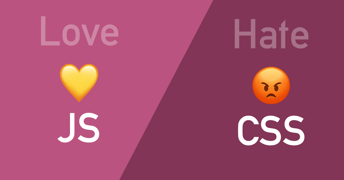
I love JavaScript but hate CSS. I just don’t have the patience to make something look good.
Writing code is fun. Solving problems is fun. That feeling of bliss when you finally get the computer to do what you want? Awesome.
But then: oh crap, the CSS. The app works fine but it looks terrible, and nobody will take it seriously because it doesn’t Look Like Apple(TM).
You’re Not Alone
First, I want to get this out there: if you like everything about front end development except CSS, you are not alone. I have known real actual professional UI developers with jobs that were either rubbish at styling, or could do it but they held their nose and tried to get it over with as quickly as possible.
I was in that spot a few years ago. CSS was like a magical black box where I’d type things in and it would, at least 60% of the time, spit out something that looked worse than when I started. I solved most CSS problems with Google and StackOverflow and hoping like crazy that someone had encountered my exact problem before (somehow, they usually had).
But I’ve since emerged from that dark place, and I can say that CSS (and the process of applying styles to a page) is a learnable skill. Even design is a learnable skill. And for the record, they are different skills.
Styling is not Design
So that we’re on the same page, let’s talk about the difference between styling and design.
I consider it styling when you’re taking an existing visual design and writing the CSS to transform a hunk of divs to match the mockups/wireframes.
On the other hand, taking a blank canvas and coming up with a beautiful looking web site is design.
You can be good (even very good) at one of these while simultaneously being unskilled at the other.
To be a front end developer, you need styling (CSS) skills but not necessarily design skills. In many companies the developers will work with designers. If you want to be able to do everything yourself though, you’ll want to learn both styling and design.
Can you avoid CSS?
Basically no :) If you want to do front end development you’ll eventually need to get your hands dirty and learn you some CSS.
In the past it was more common to have roles split up where a designer would both design the page and do the HTML + CSS for it, while the developer would handle the JS. I’m not sure how common this actually was (it wasn’t the case anywhere I’ve worked), but I’d say it’s even less common now.
It’s a safe bet that you’ll need CSS skills to excel as a front end developer at most companies.
I can tell you from experience though that CSS gets a lot better once you understand a bit about how it works. It can even be fun! I find it satisfying when I can get a page laid out just right, and know just which parameters to tweak to make it look the way I want.
What To Do
While you can’t avoid CSS entirely, there are a few things that can make styling less sucky.
Flexbox
Flexbox layout is a modern way to lay out content using CSS, much easier to use than the floats or tables of old (or the random stabbing in the dark you were doing 5 minutes ago). It has good browser support and makes it dead-simple to do some things that have traditionally been a big pain with CSS, like vertically centering things.
Take a look at this:
Look how nicely centered that little red square is! The outer box with the gray border just needs these 3 lines of CSS to make that happen:
display: flex;           /* turn flexbox on */
justify-content: center; /* center horizontally */
align-items: center;     /* center vertically */
If you right-click it and Inspect Element, you’ll see that it has more than those 3 lines… but they’re not responsible for centering the red box. That additional stuff gives it the gray border, makes it a square, centers it horizontally within this blog post (margin: 0 auto), and the bottom margin gives it some breathing room from the text below.
CSS Tricks has a great Complete Guide to Flexbox if you’re interested in learning more. I suggest checking it out! Flexbox really helped me get a grip on CSS and it’s my go-to tool for solving most layout problems now.
Also check out this Flexbox Froggy game for learning flexbox interactively in your browser.
CSS Grid
Grid is an even more modern way to do layout, and more powerful than flexbox. It can handle 2 dimensions (rows and columns) whereas flexbox is better at doing one direction or the other. Browser support is good. According to CSS Tricks:
As of March 2017, most browsers shipped native, unprefixed support for CSS Grid: Chrome (including on Android), Firefox, Safari (including on iOS), and Opera. Internet Explorer 10 and 11 on the other hand support it, but it’s an old implementation with an outdated syntax. The time to build with grid is now!
I’ve spent more time with flexbox myself, and I find it adequate for most layout tasks I need to do. Grid is more powerful, which also makes it a bit more complex.
An important thing to know is that grid doesn’t replace flexbox. I know, newer usually means better in front end land, but it doesn’t apply here. They’re different tools for different jobs (generally: grid for whole layouts, flexbox for smaller ones… but realistically you can do it all with flexbox, or do it all with grid).
You can read CSS Tricks’ Complete Guide to CSS Grid to learn more.
There’s also this fun Grid Garden game for learning the basics right in your browser.
A Logical Approach
This is sort of a meta “strategy” for dealing with CSS. As much as you can, try to avoid the random stabbing in the dark and copying-and-pasting from StackOverflow to get your layouts looking right.
Instead, try a more methodical approach.
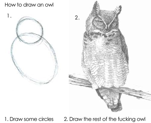
- get the item into position (flexbox, grid, or maybe absolutely positioned inside a relative container)
- set its margins and padding
- set the border
- set a background color
- then draw the rest of the owl - add box shadows, set :hover/:active/:focus states, etc.
In some ways, software engineering principles like DRY (Don’t Repeat Yourself) and the Law of Demeter can apply to styling elements on a page. As an example, consider this layout for a user’s message with their avatar:
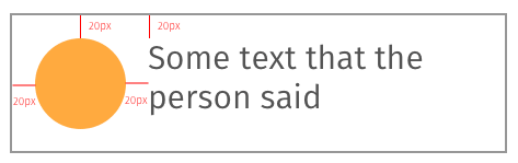
Notice that everything is 20 pixels away from the edges of the box. One way to achieve this would be to set the margin of both elements in the box to 20px.
But that has some downsides. First off, there’s repetition: what happens if that margin needs to change? Gotta change it in 2 places!
Secondly, shouldn’t it be the box’s “responsibility” to determine how far inset its elements are, rather than leaving it up to each element to decide its own distance from an edge? Think of the box as a picture frame: it’s not the picture’s job to decide how wide the frame around it is… that’s the frame’s job. You should be able to swap out the content/picture and the frame should do the right thing.
A better way to do this layout would be to set the box’s padding to 20px, so then the contents can be blissfully unaware of where they need to be. This also makes it easier to add new elements inside the box too – you don’t need to explicitly tell each element where to place itself.
This is a tiny example just to illustrate the point, which is that a bit of forethought and a logical approach can make styling go much more smoothly.
Want to see a whole layout come together? Check out my CSS layout tutorial.
Frameworks
CSS frameworks can help you get projects started quickly, and even make up for a lack of design skills. They are usually available as installable libraries with npm/yarn, or from a CDN.
Each one has its own visual style, so you’ll want to weigh the appearance of each when you make a choice. CSS frameworks help you build a nice-looking app without fussing over the design so much.
Here are some popular choices:
-
Tailwind CSS - Tailwind is a “utility-first CSS framework,” and it takes a different approach than most others. It comes with a set of utility classes that make it easy to apply styles directly in the HTML. Lots of people swear by how much more productive they are with it. The creator, Adam Wathan, has a well-made set of free screencasts on the site explaining how to use it, too. A nice side effect of Tailwind is that the class names don’t stray too far from how things actually work. Writing out
class="flex justify-center items-center"on a div is easier than writing the CSS itself but you can pretty much read it like CSS (and it’ll help you get better at CSS, too!). Not everyone likes the utility-classes approach though, with lots of class names in the HTML. Try not to write it off at first glance. -
Bootstrap - Extremely popular (read: lots of questions and answers on SO) and decent looking. The latest version (v4) is more modern looking, but the older ones can look a bit dated these days. You can customize it with some of your own CSS, or use free and paid themes to change the look. If you’re using React, have a look at react-bootstrap for a bunch of pre-made components like modal dialogs, popovers, forms, etc.
-
Ant Design - A nice-looking design system with versions for React, Vue, and Angular.
-
Material UI - A React-specific UI framework that uses Google’s Material Design system. If you like the Google look, check this one out.
Action Steps!
- Find 3 layouts to copy. These could be small elements of sites you use (a single tweet, a Pinterest card, etc) or they could be physical things like a credit card or a book cover.
- Read the Complete Guide to Flexbox.
- Use flexbox to create the layouts you picked in Step 1.
- Read my CSS layout tutorial to see how to turn a sketch into HTML and CSS.