Creating layouts is one of the hardest parts of front end development for a lot of people.
You can spend hours trying random CSS properties, copying and pasting from Stack Overflow, and hoping to stumble upon that magical combination that will produce the layout you want.
If your usual strategy is to approach layout in an item-by-item way – put A over here, and now that A is in its place, I want to put B over there… well, that’s a guaranteed route to frustration. CSS doesn’t work like Sketch or Figma or Photoshop.
In this post I want to show you a way to approach layouts holistically, as a cohesive problem to be solved.
We’ll go through a small example, start to finish, and I’ll explain all the CSS along the way – so even if you don’t know or remember how position and display work, or you can’t tell your align-items from your justify-content, you’ll get something out of this.
We’re also gonna use plain HTML and CSS here, so you don’t need to know anything about React/Vue/Angular/CSS-in-JS or even JavaScript. The exact same techniques will work in your framework of choice, too, because plain HTML and CSS are the core technologies that everything else rides on.
Sound good? Let’s get into it.
A Small Layout Example
For this post we’re going to replicate something that looks like a tweet:

Whether you’re starting from a sketch like this, or a pixel-perfect mockup, it’s a good idea to have something to go off of.
CSS layout goes more smoothly when you’re not trying to cobble it together in the browser while simultaneously designing it in your head. You absolutely can get to that level! But if you’re reading this, I’ll assume you’re not there yet :)
First Step: Identify the Pieces
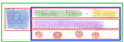
Before we write any HTML or CSS, we’ll highlight the individual parts of this layout:
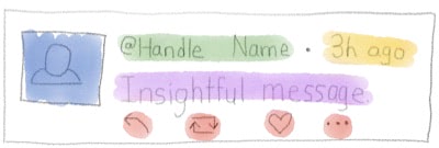
When laying things out with CSS I find it helpful to think in terms of rows and columns. So you either have elements going down the page one-after-another, or a series of elements arranged left-to-right. Thinking in terms of rows and columns maps nicely to two layout techniques CSS gives us: Flexbox and Grid.
This layout doesn’t really look like rows and columns, though. There’s an image flush-left, and a jumble of stuff to the right of it.
Second Step: Draw Boxes Around Stuff
Let’s draw some boxes around the elements and see if we can get this into some semblance of rows and columns. We’ll put boxes around the parts that are flowing in the same direction.
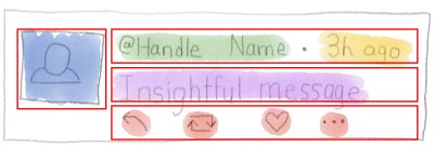
Every element you place on the page with HTML is basically a rectangle. Sure, sometimes they have rounded corners, or they’re circles, or fancy SVG shapes… Often you don’t actually see a bunch of rectangles on the page. But you can always draw a bounding box around a thing. So it helps to imagine everything as a rectangle.
I mention the rectangles because if you have a set of items you need to align – like the first row with the Name/@handle/Time or the last row with the icons – you can always wrap them in a box for styling purposes, to make it easier to arrange them.
If we were to stop here, and code this up in HTML, we’d have something like this:
<article>
  <img
    src="http://www.gravatar.com/avatar"
    alt="Name"
  />
  <div>
    <span>@handle</span>
    <span>Name</span>
    <span>3h ago</span>
  </div>
  <p>
    Some insightful message.
  </p>
  <ul>
    <li><button>Reply</button></li>
    <li><button>Retweet</button></li>
    <li><button>Like</button></li>
    <li><button>...</button></li>
  </ul>
</article>
(For brevity I’ve left out the HTML boilerplate stuff like the surrounding <html> and <body> tags, but you do need those for a fully-formed document)
And you’d see something like this (here’s a sandbox):
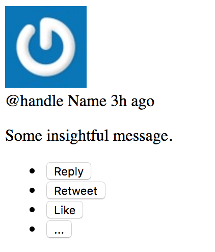
…which is not even close to what we want. But! All the content is there. And some of the clusters of elements are even flowing in the right direction.
You could make the case that this layout gets the point across even without further styling, and that’s a great benchmark to aim for with HTML.
A Note on Semantic HTML
You might wonder why I picked those particular elements – the article, the p, etc. Why not make everything a div?
Why this…
<article>
  <img ... />
  <div>
    <span/>
    <span/>
    <span/>
  </div>
  <p> ... </p>
  <ul>
    <li>
      <button> ... </button>
    </li>
  </ul>
</article>
Instead of this?
<div>
  <img ... />
  <div>
    <div/>
    <div/>
    <div/>
  </div>
  <div> ... </div>
  <div>
    <button> ... </button>
  </div>
</div>
Well, the names of HTML elements actually have meanings, and it’s a good idea to use elements that semantically match the thing they represent.
It’s good for humans, like the programmer trying to decipher the code, and the viewer using an assistive technology like a screenreader. It’s also good for search engines, which are trying to decipher what the page means, so they can show relevant ads and make boatloads of money help searchers find what they’re looking for.
The article tag represents an article-like thing, and a tweet is sorta like an article if you squint hard enough.
A p tag represents a paragraph, and the text of the tweet is sorta like a paragraph.
The ul tag represents an unordered list of things (as opposed to an ordered, or numbered, list), and in this case it holds a list of actions you can take.
The semantic meanings of HTML elements and which specific ones to use in specific situations is… not straightforward. But for the most part, a semantic element – even a very loosely-related one – will be better than a div, which just means “a division”.
Default Styling of Elements
What makes it look the way it does? Why are some elements on their own line, while others appear side-by-side?

This happens because of the default styling applied to the elements, and it brings us to our first bit of CSS knowledge: inline versus block elements.
Inline elements will squeeze next to each other on one line (and wrap if they have to, just like words in a sentence). A span, a button, and an img are all inline elements, according to default browser styling.
Block elements, on the other hand, like to stand alone. In terms of printed console output, you could think of a block element as having a \n newline before and after it. It’s like a console.log("\ndiv\n"). The article, div, li, ul, and p tags are block-level elements.
In the example above, notice how the avatar image is on its own line, even though the img tag is inline? That’s because the div below it is a block element.
Then, notice how the @handle, Name, and time are all on one line? That’s because they’re inside span tags, which are inline elements.
Those three are on a separate line from the “insightful message” because (a) they’re within a div, which will have a newline after it and (b) the p tag is also a block element, so it would’ve forced a newline too. (you don’t see 2 newlines though, for the same reason that HTML combines adjacent whitespace).
If you look closely, you’ll notice the space above and below the “insightful message” is bigger than the space between the avatar image and the handle/name/time below it. That space is controlled by the default styles too: p tags have a top and bottom margin.
You’ll also notice the bullets on the list of buttons, and that the bulleted list is indented. That’s all default styling too. We’re gonna turn it off in a bit.
Step Three: More Boxes
We want to arrange the avatar image on the left, and everything else to the right. Given what you know about inline and block elements, you might think you could just wrap the right-side stuff in an inline element like a span.
That won’t work, though. An inline element won’t prevent block elements inside it from breaking the line.
To arrange elements the way we want, we’re going to need something more powerful, like Flexbox or Grid layout. We’ll solve this one with flexbox.
How Flexbox Works
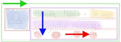
CSS “flex” layouts can arrange items into rows or columns. Within a single element, flexbox is a one-dimensional layout system. In order to have both rows and columns (like in our tweet design), we’ll need to add a few wrapper elements to flip the direction: column-wise on the outer one, then row-wise for the inner-right one, and so on.
You can turn on flex layout for a container by setting the property display: flex;. The container itself will then be a block-level element (so it’ll get its own line), and the elements inside the container will become “flex items” – meaning they’re no longer inline or block; they’re controlled by the flex container. (pro tip: there’s also a display: inline-flex if you want your flexbox container to render as an inline element).
In our case, we’ll have a few flex containers nested within each other, so that we can arrange some of them into rows and some into columns.
We’ll arrange the outer wrapper (the green box) into columns, then the blue box will be arranged into rows, and each of the red boxes will be columns again.
Why Flexbox Instead of Grid?
I’m using flexbox here instead of CSS Grid for a few reasons. I think flexbox is a bit easier to learn, and it’s also better-suited to small layouts than grid. Flexbox is especially good for layouts where things are mostly rows or mostly columns.
The other important thing to know is that even though Grid is newer than Flexbox, Grid does not replace Flexbox. They are each well-suited to different kinds of layouts, and it’s good to know both. In some layouts you might even use both – say, Grid to lay out a page and Flexbox for a contact form within the page.
I know, I know… in other corners of web dev, the “new hotness” always replaces the “old and busted”, but CSS doesn’t work that way. Flexbox and Grid happily coexist as two different tools in the box.
There’s almost always more than one way to solve a problem with CSS!
Step Four: Apply Flexbox
Alright, now that we have a plan, let’s apply some styles. I’ve gone and wrapped the left-side stuff in a div, and given a class to most of the elements to make them easier to target with CSS.
<article class="tweet">
  <img
    class="avatar"
    src="http://www.gravatar.com/avatar"
    alt="Name"
  />
  <div class="content">
    <div class="author-meta">
      <span class="handle">@handle</span>
      <span class="name">Name</span>
      <span class="time">3h ago</span>
    </div>
    <p>
      Some insightful message.
    </p>
    <ul class="actions">
      <li><button>Reply</button></li>
      <li><button>Retweet</button></li>
      <li><button>Like</button></li>
      <li><button>...</button></li>
    </ul>
  </div>
</article>Visually, it still looks the same.

That’s because divs, aside from being block elements (and introducing a newline if there wasn’t one) are otherwise invisible. When you need something to contain other elements, and there’s not a more semantic option, a div makes
a great wrapper.
Here’s our first bit of CSS, which we’ll put inside a style tag inside the head tag of the document:
<head>
  <style>
    .tweet {
      display: flex;
    }
  </style>
</head>
(I’m going to leave out the head and style tags from the rest of the examples, but just know that all of this CSS code will go into the style tag)
It’s a step in the right direction! We’re using a class selector to target all elements with the class of tweet. We only have one such element, but if we had ten of ‘em, they would all be flex containers now.
The leading . in CSS means it’s a class selector. Why a .? I dunno. You’ll just have to commit that one to memory.
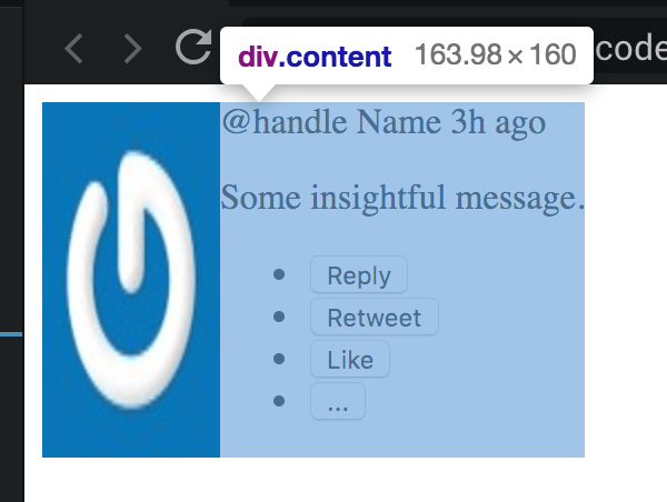
Now the content is to the right of the avatar… but the image is skewed pretty weird.
This is because, by default, a flex container will:
- arrange its items side-by-side
- make them only as wide as the content they contain, and
- set all of their heights based on the tallest one.
We can control their vertical alignment with the align-items property.
.tweet {
  display: flex;
  align-items: flex-start;
}
The default for align-items was stretch, but setting it to flex-start shoves them up to the top, and it lets the items govern their own heights.
Direction: Row or Column?
By the way, the default direction for flex containers is flex-direction: row;. Yes, it’s called “row,” even though, depending on how you look at it, you might be inclined to call that 2 columns. Think of it instead as a row of items side-by-side and it’ll make more sense.
Kind of like this picture of a vase. Or two faces. Whatever.
Content Should Take More Space
The flex items only take as much horizontal space as they need, but we’d like the content area to take up as much width as possible.
To do that, we’ll apply the flex: 1; property to the content div. (Since it has a class, we’ll use another class selector!)
.content {
  flex: 1;
}
And we’ll also add some space between the avatar and the content, by giving the avatar a little margin:
.avatar {
  margin-right: 10px;
}![]()
Looking a little better!
margin vs padding
So… why margin instead of padding? And why put it on the right of the avatar, instead of the left of the content?
As a general rule: put margins on the right and bottom of things, instead of left and top.
At least for layouts like English, things flow from left to right and top to bottom, so in a sense, each element “depends on” the one to its left, or the one above it.
With CSS, every item’s position is affected by those “before” it. (at least until you start messing with position: absolute and friends)
Separation of Concerns
Technically, in this case, where & how we place the gap between the avatar and the content doesn’t really matter. Space is space, and there are no borders to interfere (padding goes inside borders; margin goes outside).
But it does matter in terms of maintainability, and in terms of how you think about the elements from the standpoint of organization.
I try to think of each element as a standalone thing, with the same intention as having a JavaScript function that only does One Thing: if each thing only has one job to do, it’s easier to write the code, and easier to debug when it goes wrong.
If we had added the margin to the left of the content, and then one day decided to delete the avatar, we’d be left with that space. We’d have to hunt down what was causing the extra space (the surrounding tweet? the content?) and get rid of it.
Or, if the content had the left margin and we decided to replace the content with some other thing, we’d need to remember to add the space back to whatever took its place.
Ok, that was a lot to say about 10 pixels. Put the margins on the right and bottom. Let’s get back to styling.
Removing the List Style
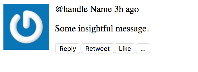
The ul unordered list and the li list items inside it come stock with a bunch of space on the left, and bullets. We don’t want any of that.
The unordered list has a lot of left padding that we can turn off. Let’s also make it a flex container, so that the buttons will be arranged side-by-side (in a row, remember… with flex-direction: row by default)
The list items have a list-style-type of disc which shows the bullets, and we can turn that off by setting list-style: none; (list-style is a shorthand property that sets multiple other properties, including list-style-type, at the same time).
.actions {
  display: flex;
  padding: 0;
}
.actions li {
  list-style: none;
}
The .actions selector is just another class selector. Nothing special there.
The .actions li selector, though, says “all li elements anywhere inside elements with class actions”. It’s a combination of a class selector (.actions) and an element selector (li).
Separating selectors with a space like that narrows down the selection with each one. CSS actually reads selectors in reverse order. It goes “find all the lis on the page” and then “ok now only target the lis that are somewhere inside an element with class of actions”. You can think about it either way and you’ll get the same result. (more on the reasoning behind it at StackOverflow)
Spread out the Buttons
We can spread out the buttons a few ways.
One would be by setting the justification of the flex items. You’re probably familiar with these buttons at the top of pretty much every rich text editor ever:

They justify the content in your document to the left, center, right, or, uhh, “justified” a.k.a. full-width.
In flexbox you can do the this with the justify-content attribute. When you’re in flex-direction: row (the default, and the one we’ve been using so far), justify-content will move the items left and right. It defaults to flex-start (so everything is squeezed to the left). If we set justify-content: space-between on the .actions it will distribute them evenly across the entire width, like this:

That’s not quite what we want, though. It’d be better if they didn’t span the whole width. So take that out.
Instead, we can apply a right margin to each of the list items to space them out. Let’s also give the whole tweet a border so we can tell what’s going on. 1px solid #ccc will make it 1 pixel wide, a solid line (as opposed to dotted or dashed) and gray.
.tweet {
  display: flex;
  align-items: flex-start;
  border: 1px solid #ccc;
}
.actions li {
  list-style: none;
  margin-right: 30px;
}
Now it looks like this:

The buttons look better, but the border highlights the fact that everything is right up against the edge of that tweet container. Let’s give it some space with padding.
.tweet {
  display: flex;
  align-items: flex-start;
  border: 1px solid #ccc;
  padding: 10px;
}
Now the tweet has some padding, but there’s also some extra space coming from somewhere. If we highlight the elements in the browser’s developer tools, you’ll notice margins above and below the p and ul elements (in Chrome devtools, margins are orange and padding is green):

It’s also interesting that the margin between the lines is the same as above and below – it’s not doubled up! That’s because CSS collapses margins vertically. When two margins touch top-to-bottom like this, the bigger one wins. Read more about collapsing margins at CSS-Tricks.
For this layout, I’ll change the margin manually on those 3 elements on the right: the .author-meta, p, and ul. For a real site layout you might consider pulling in a CSS reset to give you a common starting point across the different browsers.
p, ul {
  margin: 0;
}
.author-meta, p {
  margin-bottom: 1em;
}
Separating selectors with commas , is a way to apply a set of properties to multiple selectors at once. So p, ul says “all p elements, AND all ul elements”. It’s a union of both.
We’re also using a new unit here, the em in 1em. One em is equal to the body font size in pixels. The default font size is 16px (16 pixels high), so in our case 1em == 16px. As the font size changes, the em scale changes with it, so 1em is a nice way to express “I want the margin below the text to be as tall as the text, whatever that is.”
And now we have this:

Now let’s make the image a bit smaller, and turn it into a circle. We’ll make it 48px, which is the same size Twitter uses.
.avatar {
  margin-right: 10px;
  width: 48px;
  border-radius: 50%;
}
The border-radius property lets us round the corners of boxes, and there are a few ways to specify its value. You can give it a number in px or em or another unit, if you want a small radius. Here’s border-radius: 5px for instance:

If we set the border radius to half the width and height (24px in this case) we’ll get a circle. But an easier way is to set it to 50%, which will figure out the correct size to make a circle without us having to know the exact size ahead of time. And, bonus, if the size changes later, we don’t need to touch the border-radius at all!
![]()
Draw the Rest of the Owl
There are a few more changes we can make to polish up the final product.
We’ll set the font to Helvetica (the one Twitter uses), bring the font size down a bit, bold the Name, and, um, flip the order of the “@handle Name” (in the HTML) because that’s not how it looks on Twitter :D
.tweet {
  display: flex;
  align-items: flex-start;
  border: 1px solid #ccc;
  padding: 10px;
  /*
    Change the font and size.
    Setting it on .tweet changes it for all child elements.
    (except the buttons. buttons are weird)
  */
  font-family: Helvetica, Arial, sans-serif;
  font-size: 14px;
}

.name {
  font-weight: 600;
}

.handle,
.time {
  color: #657786;
}
Using font-weight: 600; is the same as font-weight: bold; Some fonts come in lots of different weights, and you can specify from 100 to 900 (thinnest to boldest). normal (the default) is the same as 400.
By the way… CSS technically does not allow comments to start with // like in JS and other langauges. The // style will work in some browsers, but it’s not safe across all of them. Surround your comments with the C-style /* */ and you’ll be all set.
One more little trick: we’ll add a raised dot between the “handle” and the “time” by using a pseudo-element. Since the dot is purely stylistic, it makes sense to do it in CSS without muddying up the HTML.
.handle::after {
  content: " \00b7";
}
The ::after part creates a pseudo-element which gets placed inside .handle, but at the end of it (“after” the content). You can also use ::before. The content attribute can be set to any text, including Unicode characters. You can go wild styling pseudo elements, same as any other. They can be handy for things like badges, notification indicators, or other little flourishes.
Icon Buttons
We’ll do one more thing, which is to replace the buttons with icons. We’ll add Font Awesome inside the head tag:
<link
  rel="stylesheet"
  href="https://use.fontawesome.com/releases/v5.8.1/css/all.css"
  integrity="sha384-50oBUHEmvpQ+1lW4y57PTFmhCaXp0ML5d60M1M7uH2+nqUivzIebhndOJK28anvf"
  crossorigin="anonymous"
/>
And then replace the actions ul with this one, where each button has an icon and some hidden text:
<ul class="actions">
  <li>
    <button>
      <i
        class="fas fa-reply"
        aria-hidden="true"
      ></i>
      <span class="sr-only">Reply</span>
    </button>
  </li>
  <li>
    <button>
      <i
        class="fas fa-retweet"
        aria-hidden="true"
      ></i>
      <span class="sr-only">Retweet</span>
    </button>
  </li>
  <li>
    <button>
      <i
        class="fas fa-heart"
        aria-hidden="true"
      ></i>
      <span class="sr-only">Like</span>
    </button>
  </li>
  <li>
    <button>
      <span aria-hidden="true">...</span>
      <span class="sr-only">More Actions</span>
    </button>
  </li>
</ul>
Font Awesome is an icon font, and it co-opts the i “italic” tag to display icons. Since it’s a font, CSS properties that apply to text (like color and font-size) will work on the icons too.
Here we’ve added a few small tweaks to make the buttons accessible:
- The
aria-hidden="true"attribute tells screen readers to ignore the icon. - The
sr-onlyclass is provided by Font Awesome. It visually hides elements that it’s applied to, while leaving them accessible to screen readers.
Here’s an excellent free egghead lesson from Marcy Sutton about creating accessible icon buttons.
Now we’ll add a little bit of style to the buttons – removing the border, giving them a better color, and enlarging the font a bit. We’ll also set cursor: pointer which will turn the mouse cursor into the “hand” you usually see when you hover over a link. Finally, .actions button:hover will target buttons that are being hovered-over, and color them blue.
.actions button {
  border: none;
  color: #657786;
  font-size: 16px;
  cursor: pointer;
}
.actions button:hover {
  color: #1da1f2;
}
Here is the final styled tweet in all its glory:

And here’s the CodeSandbox if you want to play around with it yourself.
How to Get Better at CSS
The biggest thing you can do to improve your CSS skills is to practice.
Pick existing sites that you like, and copy them. Designers and artists call this “copy work”. I wrote an article about how to learn React with copywork and the principles all apply to CSS as well.
Pick layouts that look interesting, and a bit outside your comfort zone. Recreate them with HTML and CSS. When you get stuck, use your browser’s developer tools to inspect the existing sites and figure out their tricks. Lather, rinse, repeat :)
